
Step-by-step Bitton Church, and other new paintings.

A French lane in winter. For sale
Hello again.
Better news this month, I now have ‘wheels’. This means I’ll be able to travel a bit more off the beaten track for plein air painting, and for art group demos, etc. I visited the Mendip hills the other day, not actually very far from me, but difficult to visit without a car. Wonderful subjects here, including the likes of Charterhouse lead and silver mine remnants, which I took some photos of and by combining these arrived at the painting at the bottom of this page. Not totally convincing. I’ll be going back to paint plein air, once it gets a bit warmer.
I have been recording a few ‘demos’, potentially for Youtube, but so far not happy enough with the resulting painting. They’ll be of use some day for another project, though.
The painting at the top here was done as a demo for a one-to-one student. Very quick, but turns out to be my favourite painting done for some time. No birds, look. But I wish I’d put a puddle in it.
Meantime, I took photos at intervals whilst doing a recent painting of Bitton Church. I visited this location on a cloudy wintry day, and took some photos of the scene, though again I definitely planned to return when not so cold to plein air it. Meantime I couldn’t resist having a studio go at it, as potential for an art group demo painting.
It follows here, with some explanation:
Step one:

Step one, pencil drawing
A fairly detailed drawing to begin with. 8B pencil as always. Bockingford 200lb Not paper. Putty eraser when necessary.
I have moved all the gravestones, and dragged in the tree far right from where it was in reality. I have no qualms about making such changes to a subject. The stones were far more orderly, and there were many more of them in the left corner. My intention was to have enough to lead the eye in to the right, whilst creating some depth by means of an immediate foreground.
You’ll notice I’ve already signed the picture. I find this can be a useful way of remembering to keep that corner ‘quiet’, as intended.
Step 2

Step 2, sky, trees and grass
The sky first, pre-dampening some areas where I wanted soft edges, and the very pale patch above the church tower. Then some very dilute warm colour first, followed by a pale grey and immediately after a darker, differently coloured grey into some places (such as top-left) wet in wet.
Whilst bottom of sky still damp I then worked on some of the trees, with some therefore soft marks, including the whole of the cool, dark tree towards the right. This may have been a large holly tree, or else a yew, and the paint used was virtually neat, undiluted. (It still wasn’t as dark as I’d intended in the case of the tree in front of the tower, so I’ll be adding a bit more here in the next stage.)
I continued down to the background land, negatively painting around a few headstones, allowing the trees to blend with this, soft edged, on the whole. The grass at the back here is a slightly cooler colour than in the foreground. I added some thick, ‘dry into wet’ (as I call it) touches while this was damp for shadowed bits of clumpy grasses. Simultaneously, I kept an eye on the drying of the sky/trees, adding some dry-brush marks into this area for the tall silver birches, which are part diluted by dampness on the paper.
Finally I added the tree far-right once the sky here had dried, so it is hard edged with some dry-brush marks.
This is the point at which I first stopped, and dried the painting off with a hairdryer.
Step 3

Step 3
The tower comes next, mixing warm and cooler colours on the hoof, aiming carefully for correct tone first time. The ‘details’ of shadow on parts are added with neat paint, dry into wet, for slightly soft edges. I don’t intend to return to overpaint at all, so this kind of thing on Bockingford needs doing very swiftly, while at the right dampness.
I then re-dampen most of the tree in front of the tower and add a very strong mix of Ultra, Raw Umber and possibly some Lamp black, dry into wet for soft edged marks. Only because I didn’t feel I got it quite right on the first, earlier attempt.
I then turn to the headstones, varying colour and tone, and being careful to keep the right side and tops white, for an idea of light shining here. I’ve invented this light, as the light in fact was off to the south (and the tower being at the West end of the church of course, this would have the light shining from the left as we look at it…. Except it was totally cloudy and there wasn’t any cast shadow anyway…. But I felt this might work best for the painting.) As usual I don’t want to return to over-paint any of these, so aimed for the desired tone, colour, and any texture, first time.
The background building on the left was added at this point. Very loose, allowing roof, wall and chimney to bleed into each other, wet-against-wet. Dry-into-wet windows added with neat paint. I also added the tree/bush on the left whilst here, softening some brush marks away in part with clean water.
Step 4

Step 4
The rest of the church. I did this end first, again dry into wet for the window ‘detail’, being a very loose interpretation. I regret such a red roof over the doorway! For some reason I decided to put my foot down and hammed it up! I was listening to you lot who keep telling me to use brighter colours. You know who you are (and you’re probably saying ‘I like the red roof’)…. Hmmm.
Final stage

Final painting, Bitton church in winter, South Gloucestershire. For sale.
This was about the shadows really. A few added next to headstones, and especially darkening the right-hand corner, as if this has a cast shadow over much of it from tree/s off to the right. Again, being fairly careful to preserve the light on the top/right of the headstones.
I added a few birds to the sky. Well, you know.
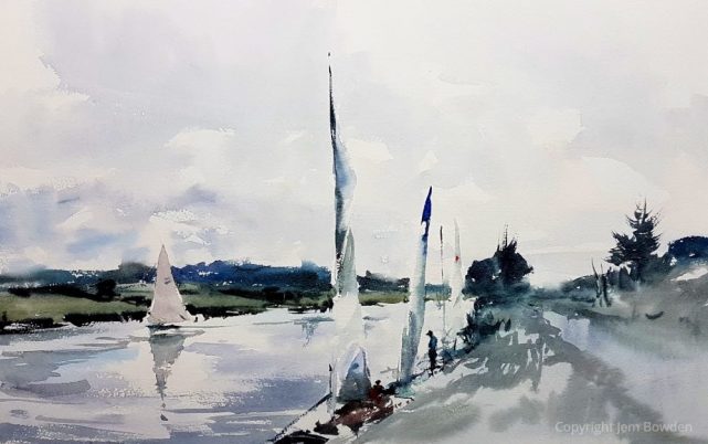
Sailing at Saltford. For sale

At Charterhouse lead mines, Mendip hills. For sale
love your work…. beautiful atmosphere in each one
Thank you Catherine, very kind of you.
Hi, I love the way you paint, the lively colours and letting in the light. I can see you are an admirer of Edward Wesson. My mother went on m any of his courses down to Dinton. Also Bosham. I was lucky
Enough to be taken to 2 of his demos. I wish I could paint like him (don’t we all). I also like John Yardley.
Your paintings are really lovely. So fresh.
Hi Jackie. Oh how lucky you are to have this Wesson connection. Such a pity Ted never got to do a video. Would give anything to have watched a demo and met the man. Thank you for your kind comment on my work.
Whoops! sorry. chroma.
Love this painting Jem but the red roof is just not you. Draws my eye immediately . If a high croma mark was wanted ? Sparingly On the Gothic window which in nearer the golden mean.
Yes fair enough, Alan. Though I wouldn’t want anything bright in the shadowed area. Interesting this has sparked a bit of discussion. To be honest I just had a bit too much Light Red on my brush, and despite knowing it decided to keep going rather than stop and immediately correct it. Thought I’d just see how it looked at the end. I could also go into more detail, such as by saying that the whole of that doorway/roof part of the building was badly painted in every way! (and the corner of the church nearest.) I mentioned to Patricia here, that at this point I didn’t think the painting as a whole was going that well, so was getting quite careless.
For the purposes of the blog, I’m thinking I might now amend the painting – could do this probably reasonably well on Bockingford – and re-post next month. Wouldn’t do any harm, and people may be interested to see it the other way.
Excellent “demo” Jem; and lovely work too; thanks for sharing that with us, it’s really handy to get stage-by-stage tips like this.
Cheers Roger. Glad that’s helpful.
Enjoyed your explanation of the stages in the Bitton church painting, the shadows in the final stage really bring it to life, mangy thanks.
Thank you Stephen. Agree that the final stage made a big difference. I find it’s often right at the end that things comes together – if they’re going to at all!
Thanks for the commentary on how you painted Bitton Church. I have often felt that the colours in your paintings were – how should I put it – muted? But then that was also a reflection of the light and colours of the landscapes . I gather from your response to your “critics” that you also have an emotional relationship with the sorter colours and that it is a wrench to include brighter ones. I sympathise! In this case, i think that the red roof is too bright and unbalances the overall picture. A softer red would fit better and do the job as you yourself suggest. As it is, the red is too dominating and draws the eye too easily to that point in the picture, somehow reducing contemplation of the lovely grass and gravestones.
Thank you so much for sharing your process; I learn so much every blog; I really appreciate the “warts and all” content.
Hi Patricia.
I’m glad I’m not alone re. the red roof. I agree with what you say about the effect is has in the picture, although it was intended that it would serve to draw the eye, it’s just a bit too much. In my view.
But I was only aiming to be humourous re. the advice certain friends give me sometimes regarding my preference for muted colour.
I didn’t really think the painting was going very well at the point I added the red, so there wasn’t anything to lose. Also, such a thing is done in the blink of an eye. I appreciate your message.
Absolutely beautiful paintings Jem there’s no one like you
Thank you Gillian! Very kind of you.
yes, of course, I like the red roof. Why not?
Haha! Well, fair enough, Linda. Maybe it’s just me, but I’d be happier if it was a bit less bright, and closer to how it was in reality. Still, had to try it out.